

Amsterdam, NL

Amsterdam, NL
Tutig

Visual Identity

Strategic Positioning

Digital Presence

Tutig
Visual Identity
Strategic Positioning
Digital Presence
Tutig
Visual Identity
Strategic Positioning
Digital Presence
Introduction
Access to a good tutor has always been unevenly distributed. Geography, cost, and circumstance have long determined who gets extra support and who goes without. Tutig was built to change that: a platform connecting students and tutors in a more selective, accessible, and humane alternative to the profit-driven incumbents that dominate the space. The work spans visual identity, strategic positioning, and a fully functioning MVP app, designed from the ground up as a solo creative engagement.
Digital Presence
The digital scope for Tutig covers the full stack: brand system, marketing presence, and a functioning MVP app. Designing both the brand and the product as a single creative engagement meant every decision, from the color system to the interaction patterns, was held to the same standard of clarity and accessibility.
The UX was built to feel immediate and navigable for students and tutors alike, with no dark patterns, no manufactured friction, and no experience designed to extract more than it gives. For a platform built around equity, the product itself had to embody that promise at every tap.
Strategic Positioning
The tutoring market is crowded with platforms that treat education as a transaction. Tutig was positioned as the counterpoint: a more considered, fairly priced, and genuinely human alternative for high school and university students and the tutors who serve them.
The brief was shaped by a real and timely tension: a generation of students navigating remote learning without the support systems they needed, and a community of tutors who found their in-person work disappear almost overnight. Tutig entered that gap not as a stopgap but as a long-term platform built around the people using it, not the margins surrounding them.
Visual Identity
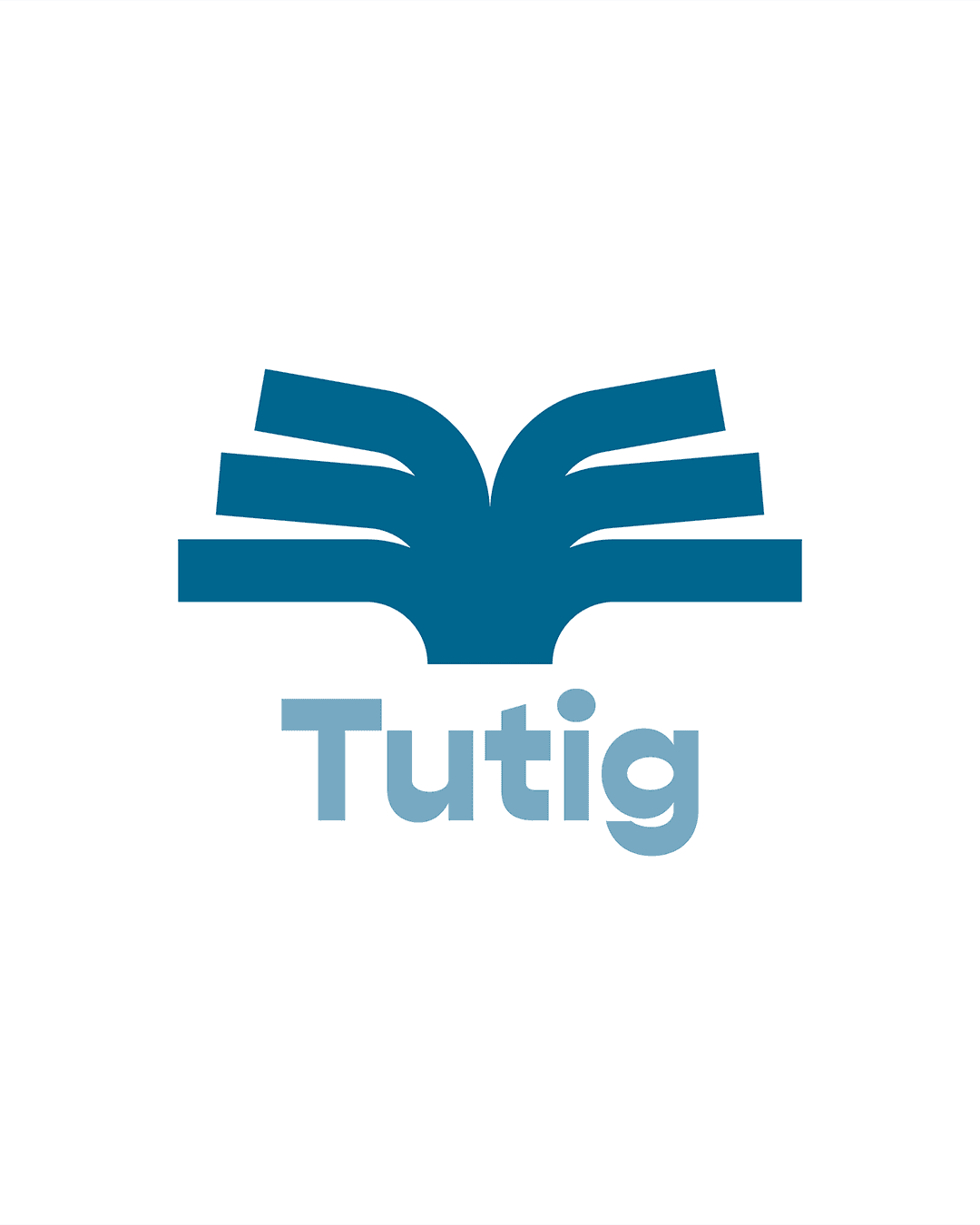
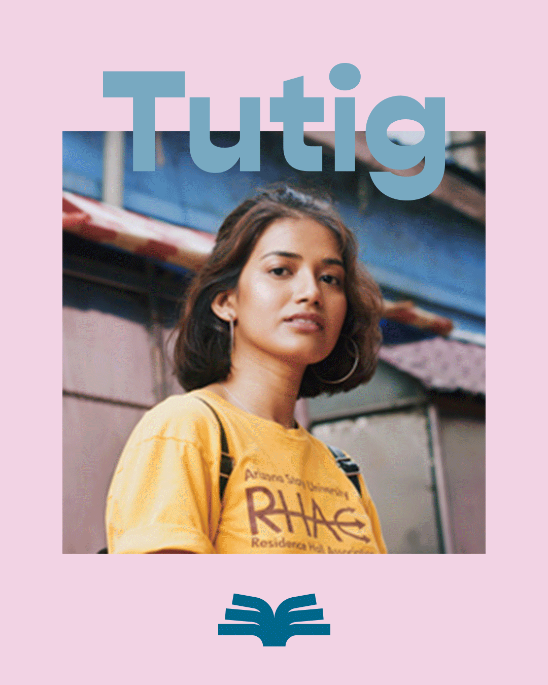
The wordmark hides its thinking in plain sight. The "U" in Tutig is replaced by an open book mark, a device that functions independently as an app icon and holds immediate recognition without the logotype beside it. The logic was simple: build a mark distinctive enough to stand alone in the context where it matters most, a phone screen.
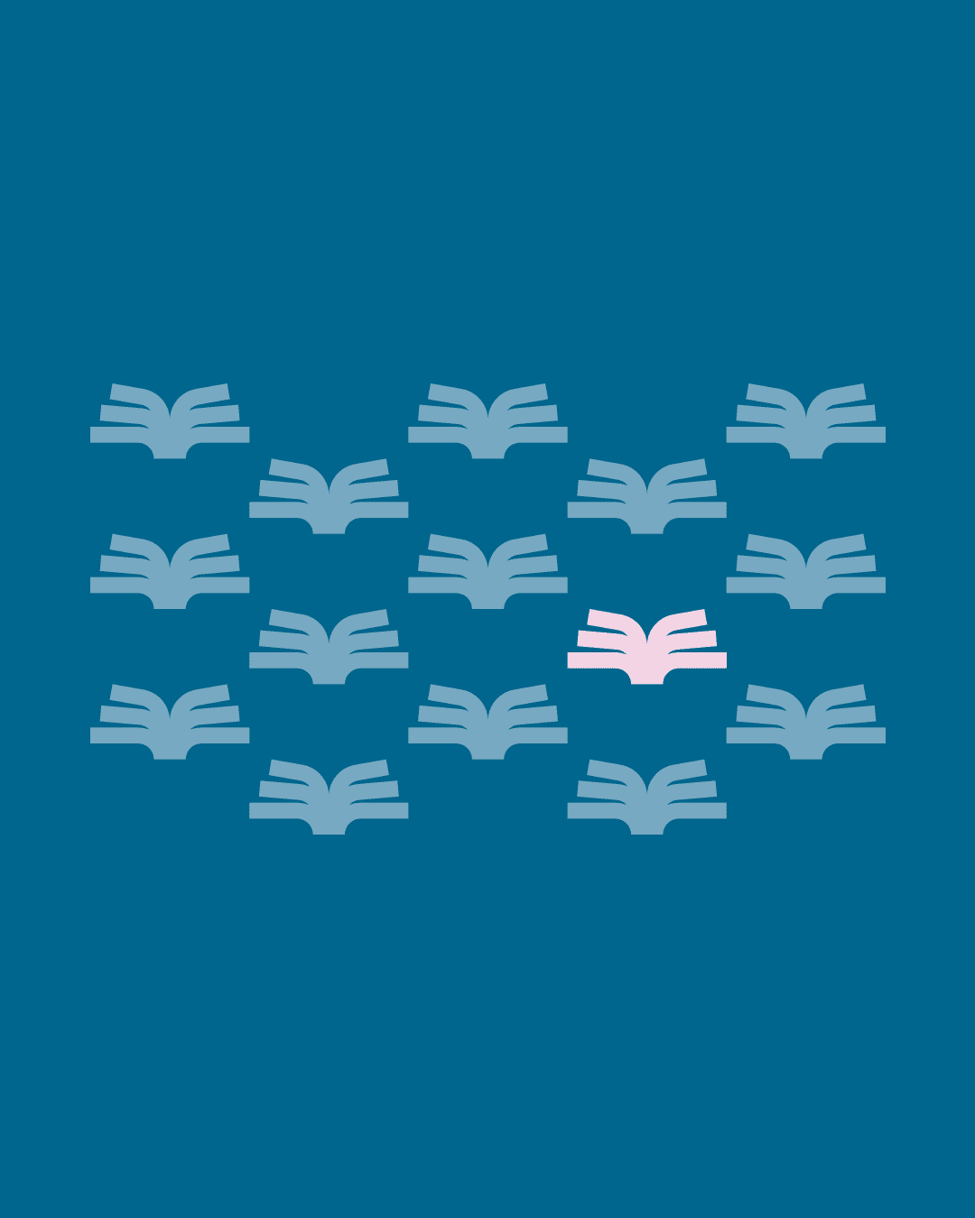
The palette of steel blue and soft pink was chosen to deliberately sidestep the cold, clinical tropes of edtech, replacing them with something warmer, gentler, and more inviting. The repeating book pattern extends that thinking into a flexible graphic system: a field of open books, each one a student or a subject, with the ability to isolate one among many.

Conclusion
Tutig is a reminder that the most meaningful design problems are often the most straightforward ones: someone needs help, someone can provide it, and the platform between them should get out of the way. The work was an exercise in building something that feels as fair and considered as the mission behind it, from the first screen to the last interaction. Education deserves better design. This was a step in that direction.
Digital Presence
The digital scope for Tutig covers the full stack: brand system, marketing presence, and a functioning MVP app. Designing both the brand and the product as a single creative engagement meant every decision, from the color system to the interaction patterns, was held to the same standard of clarity and accessibility.
The UX was built to feel immediate and navigable for students and tutors alike, with no dark patterns, no manufactured friction, and no experience designed to extract more than it gives. For a platform built around equity, the product itself had to embody that promise at every tap.
Conclusion
Tutig is a reminder that the most meaningful design problems are often the most straightforward ones: someone needs help, someone can provide it, and the platform between them should get out of the way. The work was an exercise in building something that feels as fair and considered as the mission behind it, from the first screen to the last interaction. Education deserves better design. This was a step in that direction.
[Case Studies]
Visual Identity
The wordmark hides its thinking in plain sight. The "U" in Tutig is replaced by an open book mark, a device that functions independently as an app icon and holds immediate recognition without the logotype beside it. The logic was simple: build a mark distinctive enough to stand alone in the context where it matters most, a phone screen.
The palette of steel blue and soft pink was chosen to deliberately sidestep the cold, clinical tropes of edtech, replacing them with something warmer, gentler, and more inviting. The repeating book pattern extends that thinking into a flexible graphic system: a field of open books, each one a student or a subject, with the ability to isolate one among many.
Conclusion
Tutig is a reminder that the most meaningful design problems are often the most straightforward ones: someone needs help, someone can provide it, and the platform between them should get out of the way. The work was an exercise in building something that feels as fair and considered as the mission behind it, from the first screen to the last interaction. Education deserves better design. This was a step in that direction.
[Case Studies]


cul de sac
Visual Identity
Strategic Positioning

Naming and Architecture

Art Direction

Ethical Frameworks
cul de sac
Visual Identity
Strategic Positioning
Naming and Architecture
Art Direction
Ethical Frameworks
cul de sac
Visual Identity
Strategic Positioning
Naming and Architecture
Art Direction
Ethical Frameworks


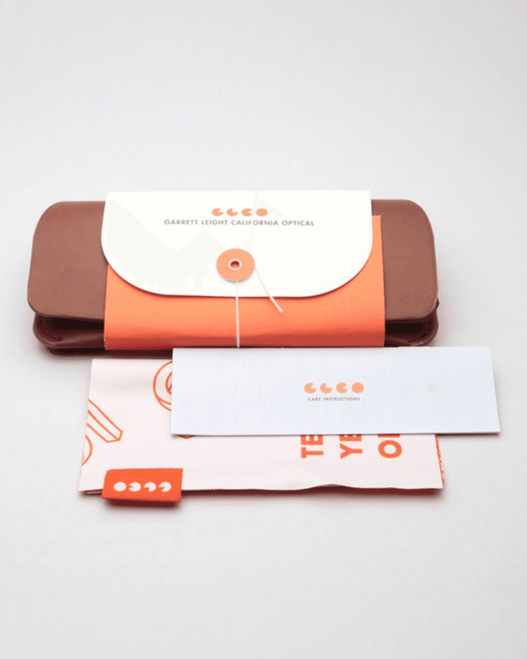
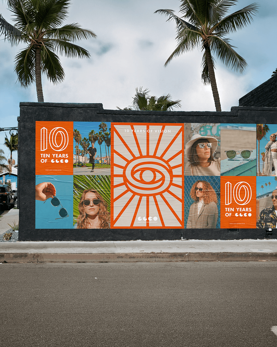
PrettyLitter

Integrated Campaigns
Strategic Positioning
Visual Identity
Digital Presence
Art Direction
Ethical Frameworks
PrettyLitter
Visual Identity
Strategic Positioning
Digital Presence
Art Direction
Integrated Campaigns
Ethical Frameworks
PrettyLitter
Visual Identity
Strategic Positioning
Digital Presence
Art Direction
Integrated Campaigns
Ethical Frameworks
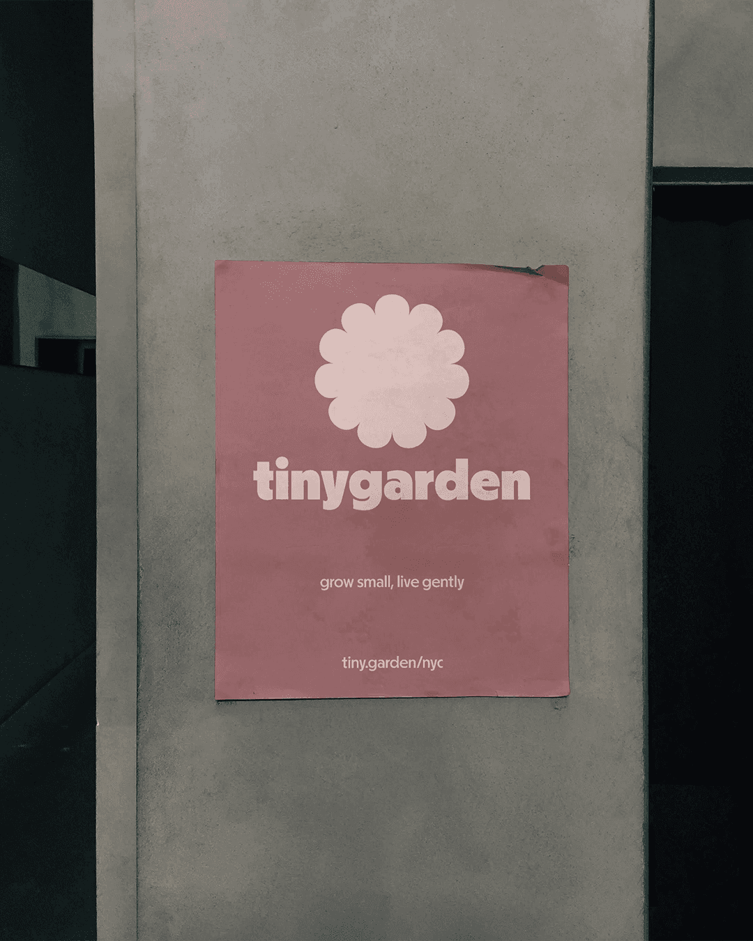


tinygarden
Visual Identity
Strategic Positioning
Naming and Architecture
Art Direction
Ethical Frameworks
tinygarden
Visual Identity
Strategic Positioning
Naming and Architecture
Art Direction
Ethical Frameworks
tinygarden
Visual Identity
Strategic Positioning
Naming and Architecture
Art Direction
Ethical Frameworks


Cubicle™ designs [humane brands for inhumane times]
Independent by choice.
Ethical by design.
© 2026 Cubicle™
Legal
Cubicle™ designs [humane brands for inhumane times]
Amsterdam, NL
Independent by choice.
Ethical by design.
© 2026 Cubicle™
Cubicle™ designs [humane brands for inhumane times]
Amsterdam, NL
Independent by choice.
Ethical by design.
© 2026 Cubicle™
Introduction
Access to a good tutor has always been unevenly distributed. Geography, cost, and circumstance have long determined who gets extra support and who goes without. Tutig was built to change that: a platform connecting students and tutors in a more selective, accessible, and humane alternative to the profit-driven incumbents that dominate the space. The work spans visual identity, strategic positioning, and a fully functioning MVP app, designed from the ground up as a solo creative engagement.