

Amsterdam, NL

Amsterdam, NL
cul de sac

Visual Identity

Strategic Positioning

Naming and Architecture

Art Direction

Ethical Frameworks

cul de sac
Visual Identity
Strategic Positioning
Naming and Architecture
Art Direction
Ethical Frameworks
cul de sac
Visual Identity
Strategic Positioning
Naming and Architecture
Art Direction
Ethical Frameworks
Introduction
Some brands simply sell products. The best ones carry a point of view. cul de sac was built on the belief that how a bag is made matters as much as what it carries, and that access to responsibly made goods should not be a luxury. The goal was something genuinely different in a category defined by sameness: adventurous without being aspirational, responsible without being preachy, and beautiful without being out of reach.
Naming and Architecture
The name carries more weight than it first appears. For many people, a cul de sac is where childhood lived: familiar, safe, and predictably circular. But it is also, by definition, a dead end. The name reclaims that image, inviting people to move out of the comfortable and predictable environments that have shaped them and into something larger. The French origin gives it an inherently international quality without prescribing a destination.
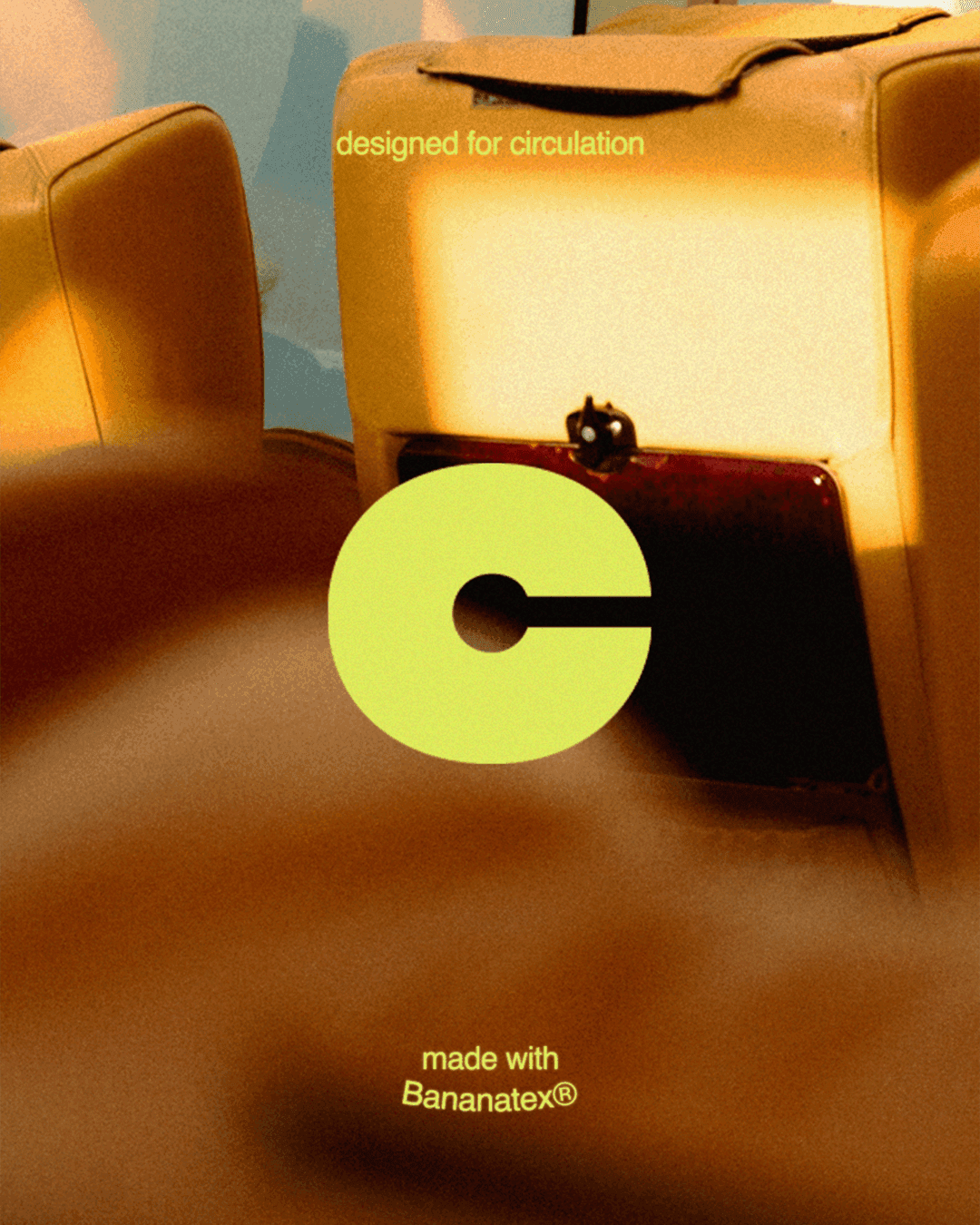
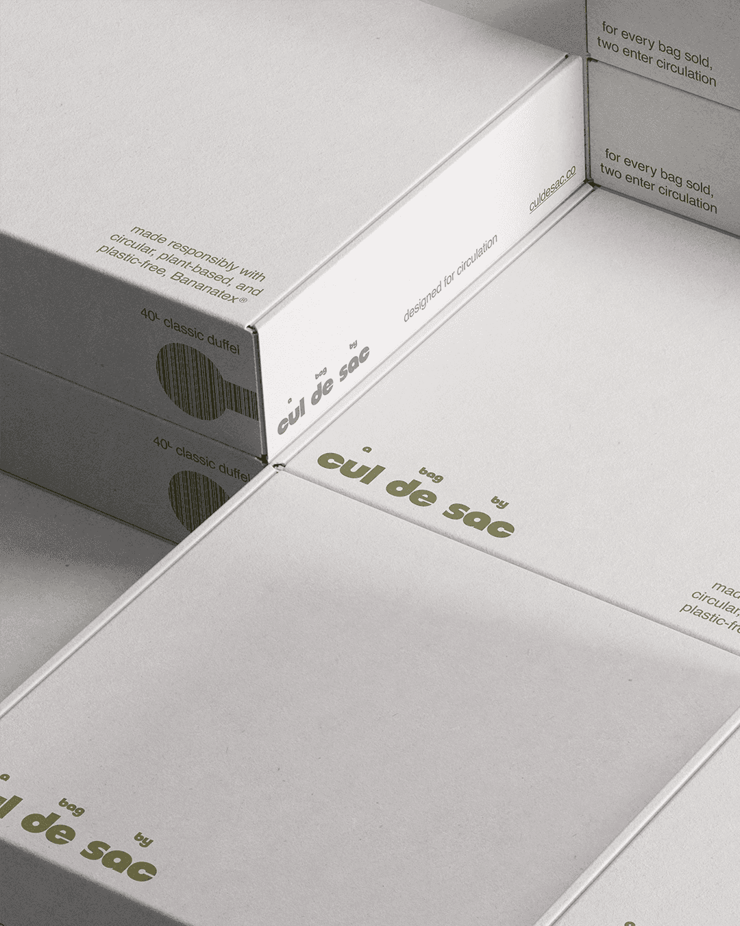
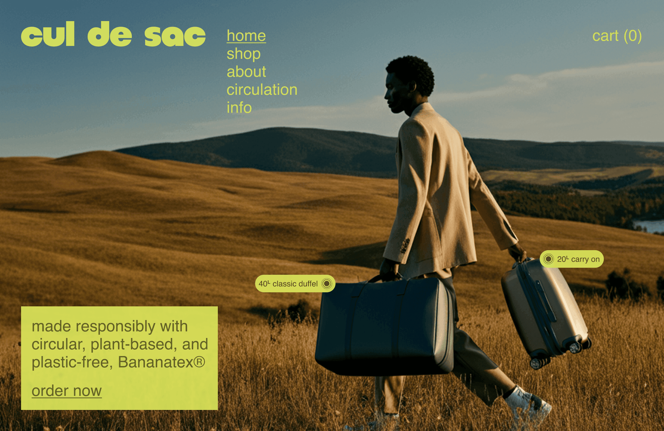
The intentional spacing in the logotype, three words where one would do, echoes the physical distance between where you are and where you want to be. And the tagline "designed for circulation" operates on three levels simultaneously: the circular life of Bananatex®, the act of traveling the world, and the literal circulation of bags into communities that need them.
Strategic Positioning
The positioning lives at the intersection of three tensions: accessible versus premium, global versus personal, giving versus selling. cul de sac was built for people who care about the world they move through and want a bag as considered as their values.
The strategy avoids the performative language of sustainability in favor of something more direct: doing the right thing quietly, priced to actually reach the people it is made for, and letting the product speak for itself. Central to that model is Circulation: for every bag sold, two enter the world, one purchased, one given, with a portion of profits supporting those who need it most.
Visual Identity
The visual identity holds a deliberate tension: the warmth of a 90s suburban childhood against the ambition of a life in motion. The rounded wordmark feels familiar and approachable, while systematic typography gives the brand modern rigidity beneath the surface.
The palette, a sharp chartreuse and soft lavender each paired with darker tonal variants, was chosen for its dual nature: energetic yet calm, maximalist in color but minimalist in application.
The primary logomark distills all of it into a single form: a C letterform that is also, unmistakably, a cul de sac. It does not explain itself. It rewards the people who notice.


Art Direction
The photography was driven by one clear intention: to show the world as it exists around you, not as it appears on a travel agency poster. Rather than iconic landmarks or fantasy destinations, the imagery centers on open grasslands and rolling hills, the kind of natural beauty within reach of almost anyone. Not everyone can afford a flight to Paris, but most people can access a hillside or a trail.
The work invites people to see their own possible adventures in the imagery, not someone else's highlight reel. The material follows the same logic: Bananatex® was selected not as a styling decision but as a strategic one, a plant-based, plastic-free fabric with a traceable story and a durability comparable to leather, communicated in copy that is specific, plain, and free of inflated eco-language.

Conclusion
cul de sac is the kind of work that matters most: a project where strategy, identity, copy, and art direction all pull in the same direction. Every decision, from the name to the material to the spacing of the logotype, was made in service of a brand that earns trust by being honest about what it is and generous in how it shows up. This is what humane brand design looks like in practice.
Naming and Architecture
The name carries more weight than it first appears. For many people, a cul de sac is where childhood lived: familiar, safe, and predictably circular. But it is also, by definition, a dead end. The name reclaims that image, inviting people to move out of the comfortable and predictable environments that have shaped them and into something larger. The French origin gives it an inherently international quality without prescribing a destination.
The intentional spacing in the logotype, three words where one would do, echoes the physical distance between where you are and where you want to be. And the tagline "designed for circulation" operates on three levels simultaneously: the circular life of Bananatex®, the act of traveling the world, and the literal circulation of bags into communities that need them.
Conclusion
cul de sac is the kind of work that matters most: a project where strategy, identity, copy, and art direction all pull in the same direction. Every decision, from the name to the material to the spacing of the logotype, was made in service of a brand that earns trust by being honest about what it is and generous in how it shows up. This is what humane brand design looks like in practice.
[Case Studies]
Visual Identity
The visual identity holds a deliberate tension: the warmth of a 90s suburban childhood against the ambition of a life in motion. The rounded wordmark feels familiar and approachable, while systematic typography gives the brand modern rigidity beneath the surface.
The palette, a sharp chartreuse and soft lavender each paired with darker tonal variants, was chosen for its dual nature: energetic yet calm, maximalist in color but minimalist in application.
The primary logomark distills all of it into a single form: a C letterform that is also, unmistakably, a cul de sac. It does not explain itself. It rewards the people who notice.
Art Direction
The photography was driven by one clear intention: to show the world as it exists around you, not as it appears on a travel agency poster. Rather than iconic landmarks or fantasy destinations, the imagery centers on open grasslands and rolling hills, the kind of natural beauty within reach of almost anyone. Not everyone can afford a flight to Paris, but most people can access a hillside or a trail.
The work invites people to see their own possible adventures in the imagery, not someone else's highlight reel. The material follows the same logic: Bananatex® was selected not as a styling decision but as a strategic one, a plant-based, plastic-free fabric with a traceable story and a durability comparable to leather, communicated in copy that is specific, plain, and free of inflated eco-language.
Conclusion
cul de sac is the kind of work that matters most: a project where strategy, identity, copy, and art direction all pull in the same direction. Every decision, from the name to the material to the spacing of the logotype, was made in service of a brand that earns trust by being honest about what it is and generous in how it shows up. This is what humane brand design looks like in practice.
[Case Studies]
Art Direction
The photography was driven by one clear intention: to show the world as it exists around you, not as it appears on a travel agency poster. Rather than iconic landmarks or fantasy destinations, the imagery centers on open grasslands and rolling hills, the kind of natural beauty within reach of almost anyone. Not everyone can afford a flight to Paris, but most people can access a hillside or a trail.
The work invites people to see their own possible adventures in the imagery, not someone else's highlight reel. The material follows the same logic: Bananatex® was selected not as a styling decision but as a strategic one, a plant-based, plastic-free fabric with a traceable story and a durability comparable to leather, communicated in copy that is specific, plain, and free of inflated eco-language.


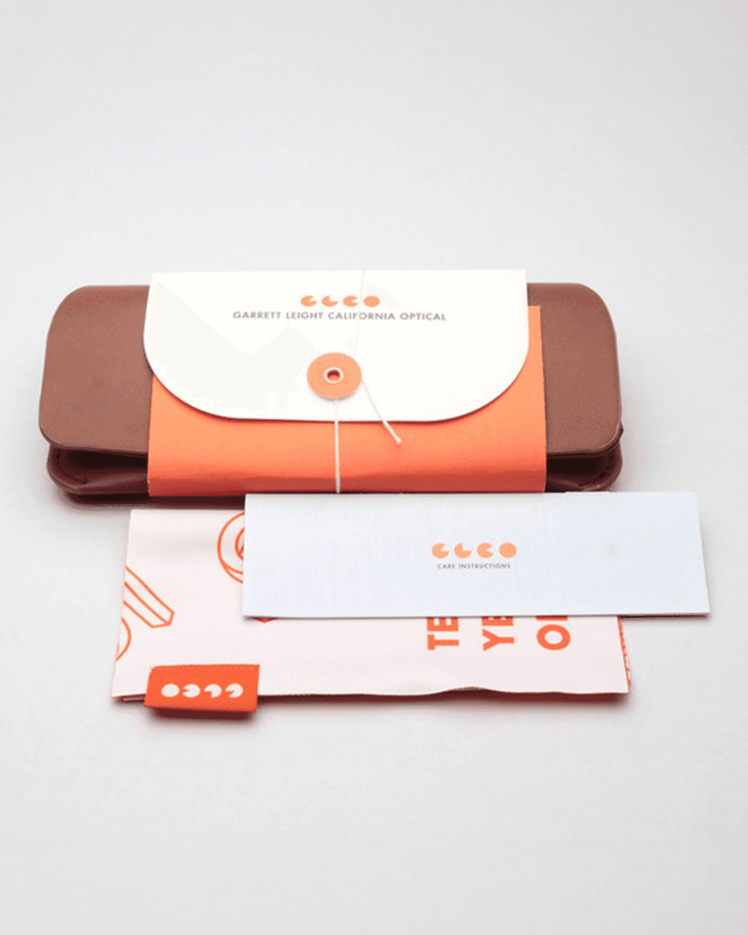
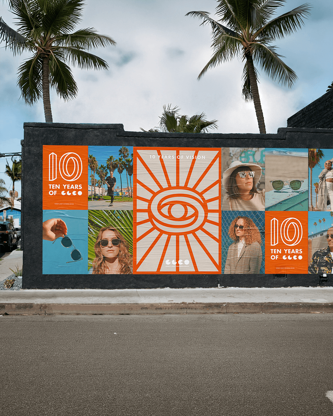
PrettyLitter

Integrated Campaigns
Strategic Positioning
Visual Identity

Digital Presence
Art Direction
Ethical Frameworks
PrettyLitter
Visual Identity
Strategic Positioning
Digital Presence
Art Direction
Integrated Campaigns
Ethical Frameworks
PrettyLitter
Visual Identity
Strategic Positioning
Digital Presence
Art Direction
Integrated Campaigns
Ethical Frameworks
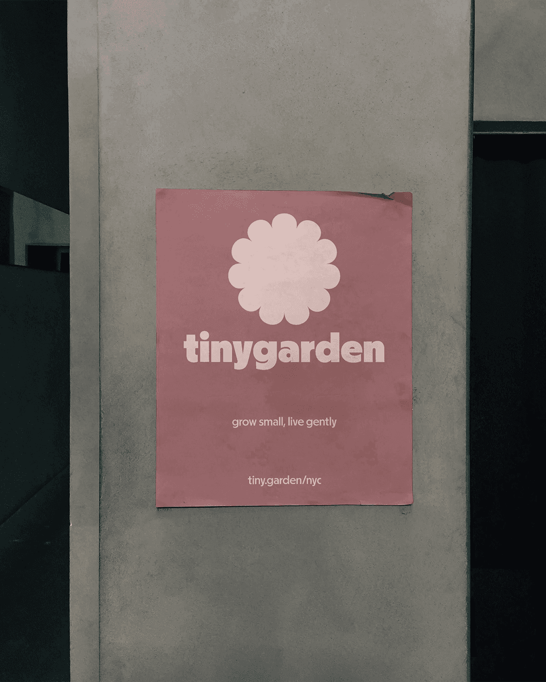


tinygarden
Visual Identity
Strategic Positioning
Naming and Architecture
Art Direction
Ethical Frameworks
tinygarden
Visual Identity
Strategic Positioning
Naming and Architecture
Art Direction
Ethical Frameworks
tinygarden
Visual Identity
Strategic Positioning
Naming and Architecture
Art Direction
Ethical Frameworks


Cubicle™ designs [humane brands for inhumane times]
Independent by choice.
Ethical by design.
© 2026 Cubicle™
Legal
Cubicle™ designs [humane brands for inhumane times]
Amsterdam, NL
Independent by choice.
Ethical by design.
© 2026 Cubicle™
Cubicle™ designs [humane brands for inhumane times]
Amsterdam, NL
Independent by choice.
Ethical by design.
© 2026 Cubicle™
Introduction
Some brands simply sell products. The best ones carry a point of view. cul de sac was built on the belief that how a bag is made matters as much as what it carries, and that access to responsibly made goods should not be a luxury. The goal was something genuinely different in a category defined by sameness: adventurous without being aspirational, responsible without being preachy, and beautiful without being out of reach.