

Amsterdam, NL

Amsterdam, NL
tinygarden

Visual Identity

Strategic Positioning

Naming and Architecture

Art Direction

Ethical Frameworks
tinygarden
Visual Identity
Strategic Positioning
Naming and Architecture
Art Direction
Ethical Frameworks
tinygarden
Visual Identity
Strategic Positioning
Naming and Architecture
Art Direction
Ethical Frameworks
Introduction
Gardening is one of the oldest forms of community. It asks very little and gives back enormously: patience, presence, something grown with your own hands. tinygarden was built on that premise, and on the belief that access to that experience should not disappear the moment someone moves to a new city.
The work here spans visual identity, strategic positioning, naming and architecture, art direction, and ethical frameworks for a community gardening organization designed to grow as thoughtfully as the things planted in it.
Naming and Architecture
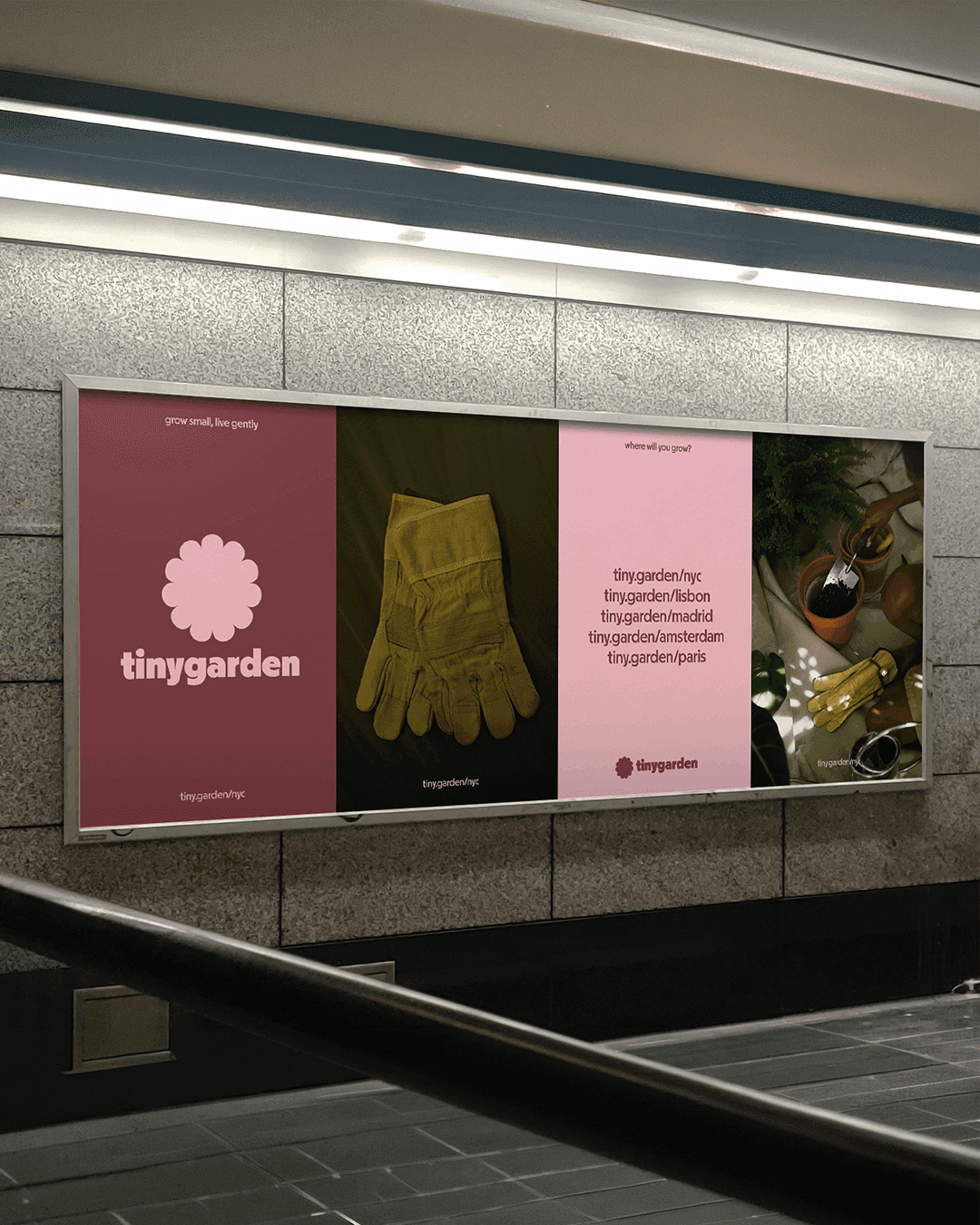
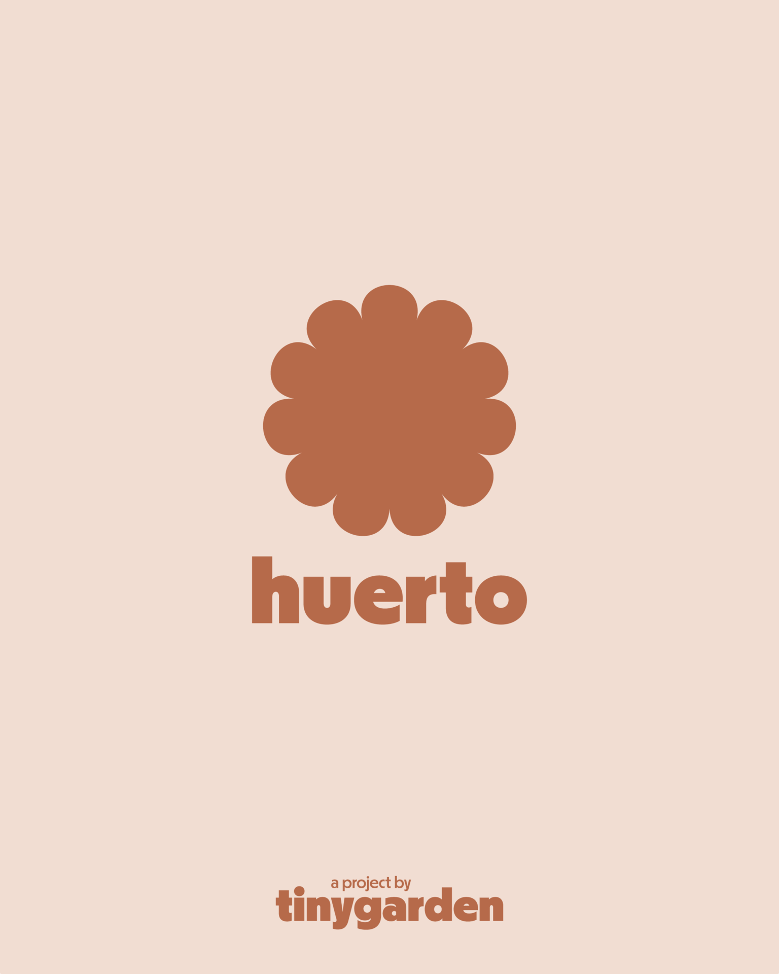
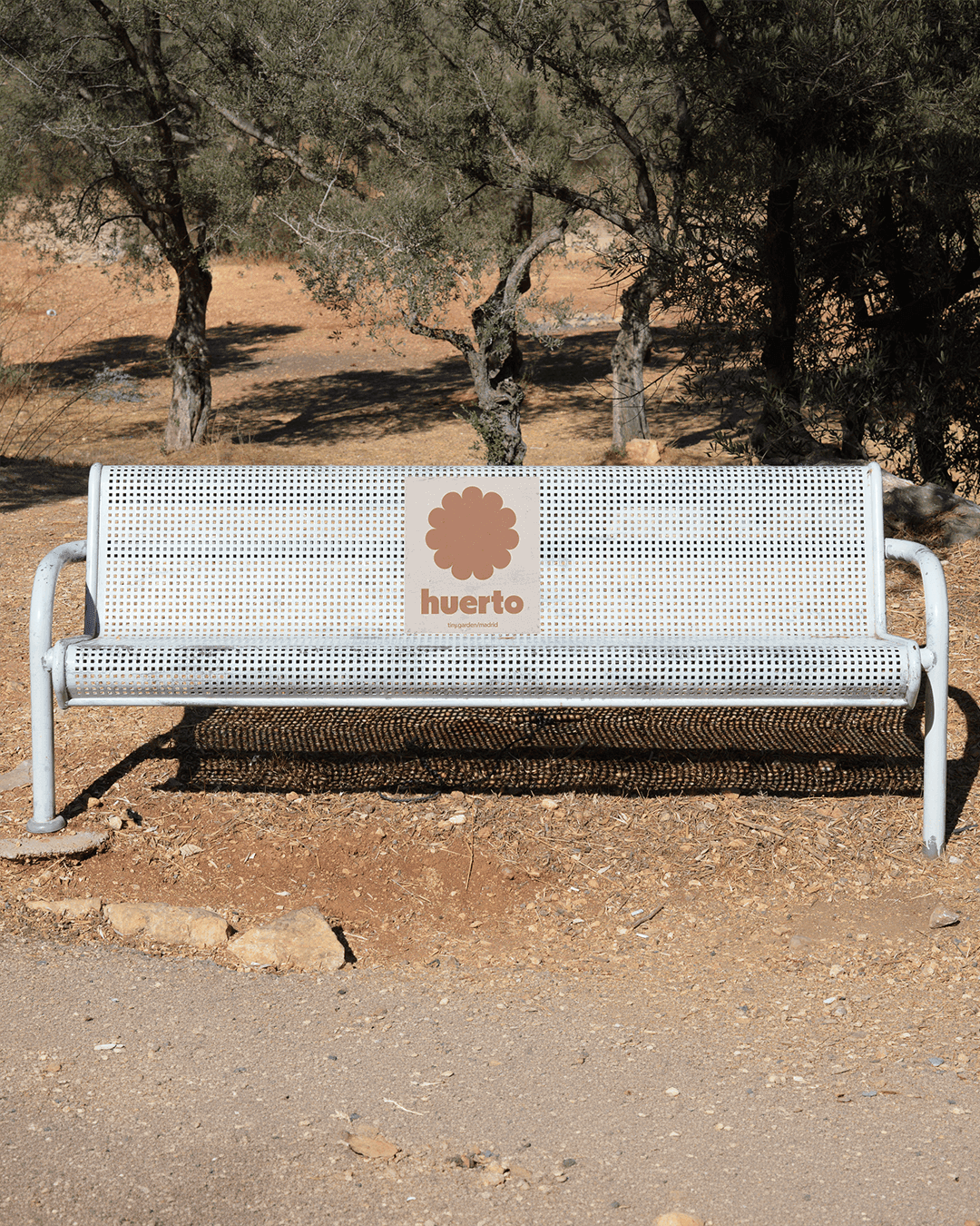
The naming system is built for expansion without entropy. tinygarden is the global anchor, clean and immediate. Each city chapter carries a localized translation: jardim in Lisbon, tuintje in Amsterdam, with the same logic applied across every location.
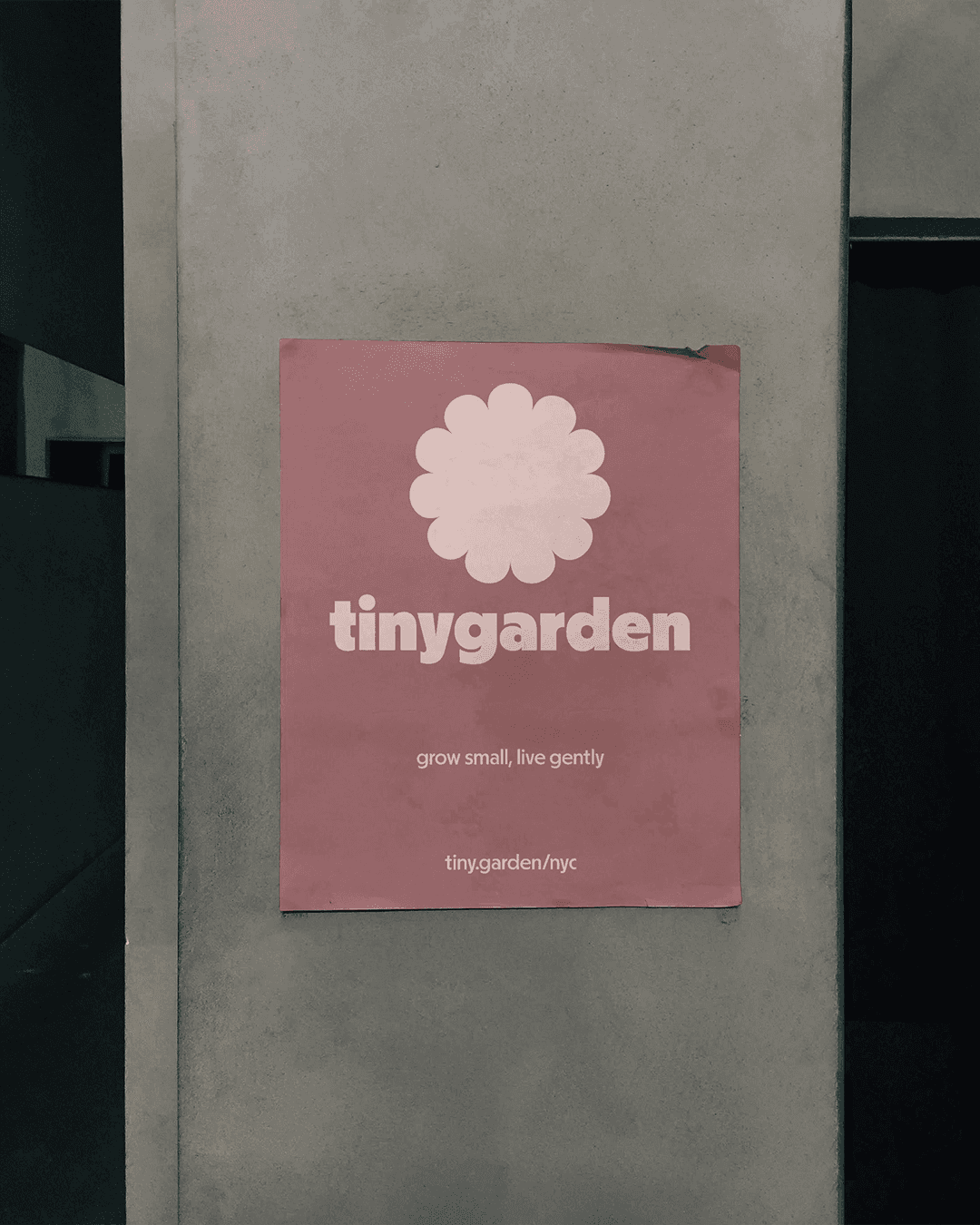
The URL structure, tiny.garden/nyc, tiny.garden/lisbon, tiny.garden/amsterdam, reinforces the architecture with the same clarity: one organization, many homes. The system was designed not just for the five current cities but as a framework the organization can carry forward independently as tinygarden continues to grow into new communities and countries.
Strategic Positioning
tinygarden sits at the intersection of community infrastructure and quiet environmentalism. The positioning was built around a simple truth: that large cities are full of people who want to grow things and have nowhere to do it. The brand speaks equally to longtime locals and newly arrived residents, bridging rather than dividing, and framing the garden plot not just as a physical space but as a point of entry into a community. "
Grow small, live gently" carries the full weight of that positioning in four words: a small footprint, a lighter environmental impact, and a more considered way of moving through the world.
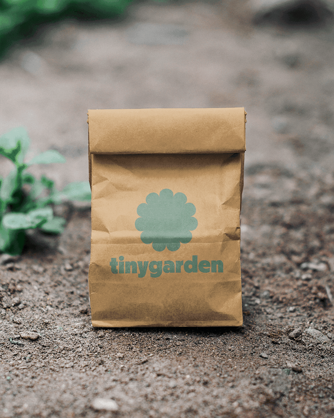
Visual Identity
The flower logomark is deliberately agnostic. It references no specific plant, no specific place, no specific culture. It is simply a universal symbol of growth, beauty, and the cyclical nature of living things, rendered with enough simplicity that the location-specific logotype can take center stage.
The rounded, lowercase typography exudes friendly and creative energy while carrying the infrastructural confidence of a modern organization that knows what it is doing.
Color palettes shift by city, each loosely drawn from local natural surroundings, all tonal, calm, and cohesive enough to read as a family. The result is a brand system that feels local everywhere and consistent everywhere at once.

Ethical Frameworks
The ethical frameworks for tinygarden are inseparable from the brand's reason for existing. Equitable access to community is not a footnote, it is the brief. The design system was built to be legible, welcoming, and clear across languages, backgrounds, and levels of familiarity with the organization.
Inclusive language standards, accessible visual design, and a scalable architecture that any future local team can adopt without diluting the whole: these were not constraints on the creative work. They were the foundation of it. "Where will you grow?" is a question the brand asks openly, and the answer should feel available to everyone.
Conclusion
tinygarden is a project about belonging. About finding a patch of earth in an unfamiliar city and putting something in it that will come back next season. The brand work was an attempt to match that intention: a system that is warm without being naive, structured without being cold, and expansive enough to follow the organization wherever it decides to grow next.
Grow small, live gently.
Naming and Architecture
The naming system is built for expansion without entropy. tinygarden is the global anchor, clean and immediate. Each city chapter carries a localized translation: jardim in Lisbon, tuintje in Amsterdam, with the same logic applied across every location.
The URL structure, tiny.garden/nyc, tiny.garden/lisbon, tiny.garden/amsterdam, reinforces the architecture with the same clarity: one organization, many homes. The system was designed not just for the five current cities but as a framework the organization can carry forward independently as tinygarden continues to grow into new communities and countries.
Conclusion
tinygarden is a project about belonging. About finding a patch of earth in an unfamiliar city and putting something in it that will come back next season. The brand work was an attempt to match that intention: a system that is warm without being naive, structured without being cold, and expansive enough to follow the organization wherever it decides to grow next.
Grow small, live gently.
[Case Studies]
Visual Identity
The flower logomark is deliberately agnostic. It references no specific plant, no specific place, no specific culture. It is simply a universal symbol of growth, beauty, and the cyclical nature of living things, rendered with enough simplicity that the location-specific logotype can take center stage.
The rounded, lowercase typography exudes friendly and creative energy while carrying the infrastructural confidence of a modern organization that knows what it is doing.
Color palettes shift by city, each loosely drawn from local natural surroundings, all tonal, calm, and cohesive enough to read as a family. The result is a brand system that feels local everywhere and consistent everywhere at once.
Ethical Frameworks
The ethical frameworks for tinygarden are inseparable from the brand's reason for existing. Equitable access to community is not a footnote, it is the brief. The design system was built to be legible, welcoming, and clear across languages, backgrounds, and levels of familiarity with the organization.
Inclusive language standards, accessible visual design, and a scalable architecture that any future local team can adopt without diluting the whole: these were not constraints on the creative work. They were the foundation of it. "Where will you grow?" is a question the brand asks openly, and the answer should feel available to everyone.
Conclusion
tinygarden is a project about belonging. About finding a patch of earth in an unfamiliar city and putting something in it that will come back next season. The brand work was an attempt to match that intention: a system that is warm without being naive, structured without being cold, and expansive enough to follow the organization wherever it decides to grow next.
Grow small, live gently.
[Case Studies]
Ethical Frameworks
The ethical frameworks for tinygarden are inseparable from the brand's reason for existing. Equitable access to community is not a footnote, it is the brief. The design system was built to be legible, welcoming, and clear across languages, backgrounds, and levels of familiarity with the organization.
Inclusive language standards, accessible visual design, and a scalable architecture that any future local team can adopt without diluting the whole: these were not constraints on the creative work. They were the foundation of it. "Where will you grow?" is a question the brand asks openly, and the answer should feel available to everyone.


cul de sac
Visual Identity
Strategic Positioning
Naming and Architecture
Art Direction
Ethical Frameworks
cul de sac
Visual Identity
Strategic Positioning
Naming and Architecture
Art Direction
Ethical Frameworks
cul de sac
Visual Identity
Strategic Positioning
Naming and Architecture
Art Direction
Ethical Frameworks


PrettyLitter

Integrated Campaigns
Strategic Positioning
Visual Identity

Digital Presence
Art Direction
Ethical Frameworks
PrettyLitter
Visual Identity
Strategic Positioning
Digital Presence
Art Direction
Integrated Campaigns
Ethical Frameworks
PrettyLitter
Visual Identity
Strategic Positioning
Digital Presence
Art Direction
Integrated Campaigns
Ethical Frameworks


Cubicle™ designs [humane brands for inhumane times]
Independent by choice.
Ethical by design.
© 2026 Cubicle™
Legal
Cubicle™ designs [humane brands for inhumane times]
Amsterdam, NL
Independent by choice.
Ethical by design.
© 2026 Cubicle™
Cubicle™ designs [humane brands for inhumane times]
Amsterdam, NL
Independent by choice.
Ethical by design.
© 2026 Cubicle™
Introduction
Gardening is one of the oldest forms of community. It asks very little and gives back enormously: patience, presence, something grown with your own hands. tinygarden was built on that premise, and on the belief that access to that experience should not disappear the moment someone moves to a new city.
The work here spans visual identity, strategic positioning, naming and architecture, art direction, and ethical frameworks for a community gardening organization designed to grow as thoughtfully as the things planted in it.